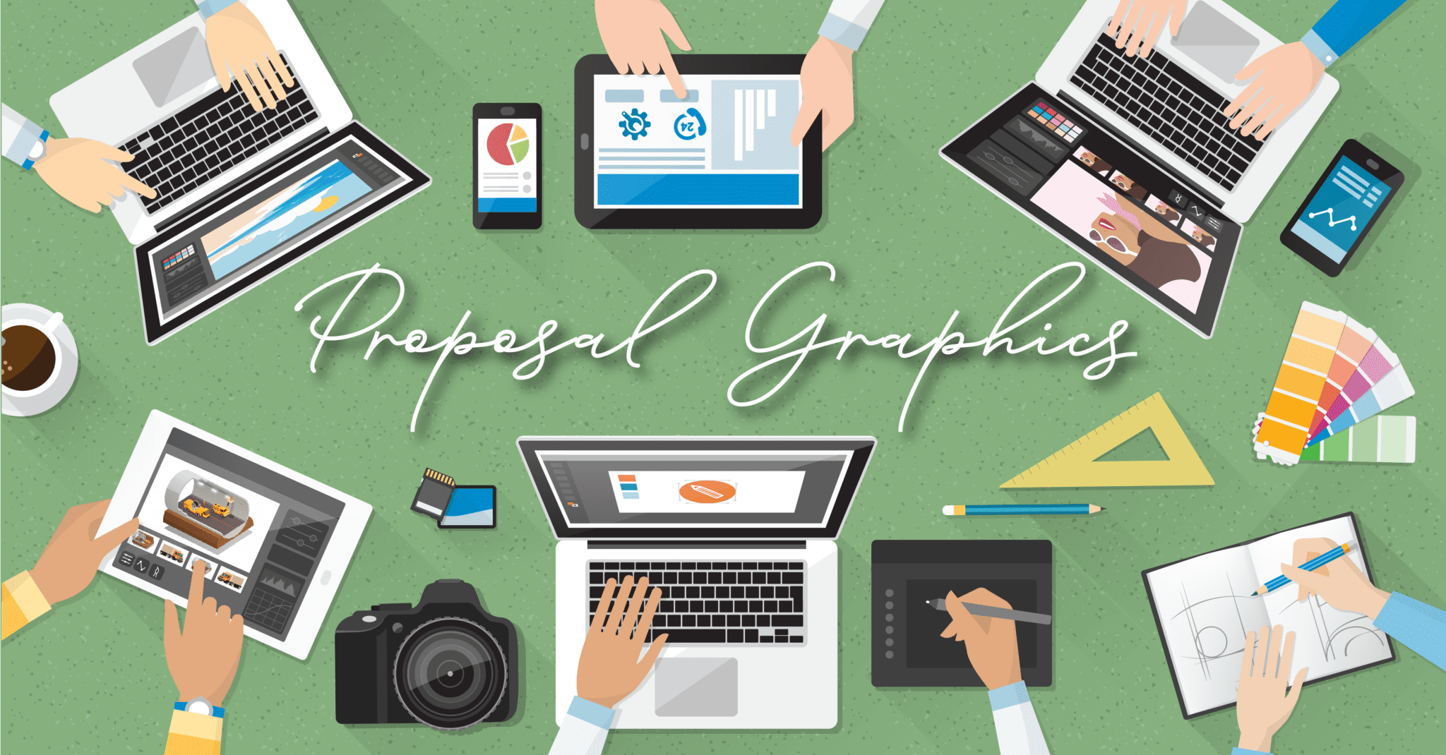
One of the best ways to boost the persuasiveness of your tender responses and business proposals is to make them easier to comprehend. If they are easier to comprehend, they’ll be easier to evaluate, and considered more favourably. One of the most effective ways to aid understanding is to use suitable proposal graphics.
But you’ll need to do more than insert pretty, decorative imagery that makes your proposal or presentation ‘look nice’. Graphic design elements need to add value to earn their place.
An opportunity to simplify, communicate and influence
Good proposal graphics aid navigation through your document by highlighting key messages, summarising sections and visually introducing ideas. In contrast, irrelevant, poorly chosen or low-quality graphics are jarring for the reader and won’t help your proposal succeed.
Proposal graphics are most helpful in situations where:
- the topic is complex. Graphics can explain complicated data or process intricacies more clearly, helping you simplify a complex message.
- the information is critical to success. Graphics can highlight your most important messages, ensuring they’re properly communicated and emphasised.
- you need to influence emotions. Graphics can set the tone of your proposal, evoking positive feelings like excitement, agreement or trust.
The benefits of using graphics in your proposals
Including graphic design elements improves the visual appeal of your proposal – making it look more professional and polished. More importantly, there are four key psychological reasons to include graphics in your submission:
1. Faster information processing
Complex information is easier to understand when presented visually. It’s even claimed that the human brain processes visuals 60,000 times faster than text alone.
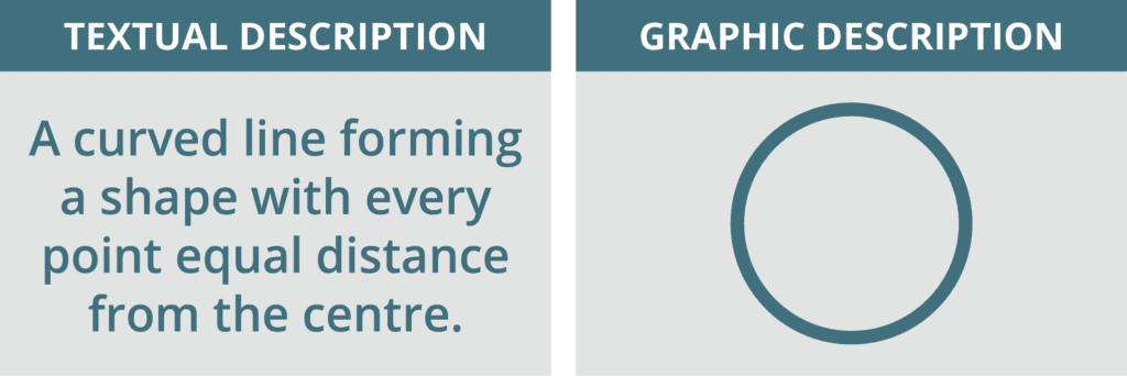
Take a look at this example. Which makes it faster and easier to comprehend a circle – the textual or the graphic description?
2. Better retention
The picture superiority effect is a documented psychological phenomenon that explains how and why people remember images better than words. It proves that our memory stores much more of what we see than what we read.
3. Emotional connection
Colours, shapes and images subtly evoke emotions that can influence an evaluator’s decision. For example, warm colours like red and orange can elicit feelings of excitement, urgency, and energy. Smooth, curved shapes can generate a sense of comfort. Thick, bold font choices can convey strength.
4. Amplified persuasion
The understanding, retention and connection aided by graphic design can help persuade your evaluator to choose your proposal over a competitor’s. A University of Minnesota study found that presentations using visual aids were 43% more persuasive than those that didn’t.
How to select the right proposal graphics
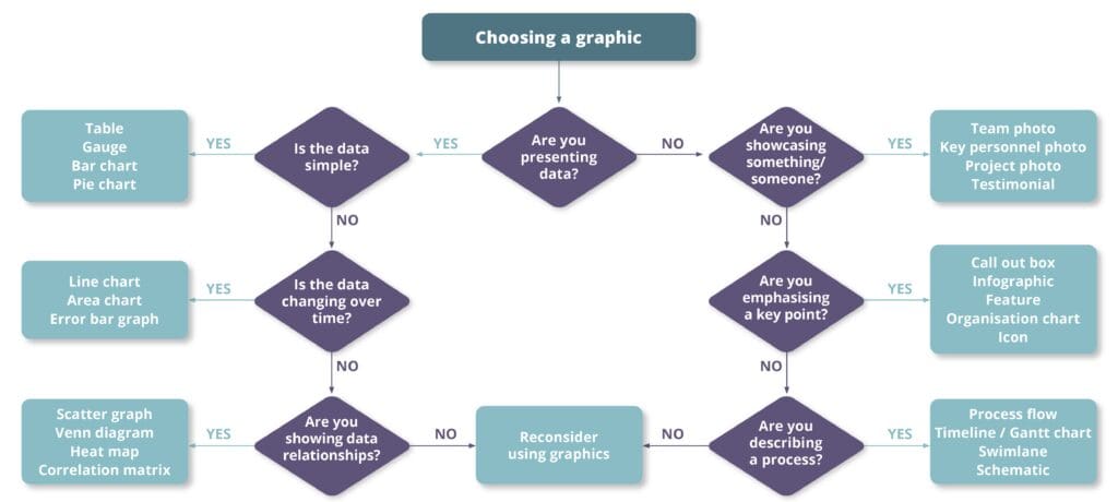
Graphic design options are endless, which can be overwhelming. Deciding which type of graphic to use is context dependent, as each is a useful mechanism for conveying a different type of information. It’s important to select one that’s best suited for your intended purpose.
At BidWrite we have a simple process for choosing the best type of graphic to present data or information. Try following our yes/no process flow below to select the right type of graphic to include in your proposal.
The different types of proposal graphics
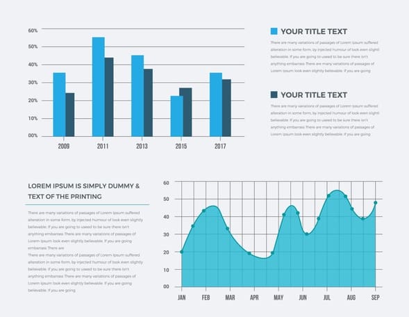
Graphs
Ideal for presenting data and statistics, comparisons, costs, trends, or performance metrics at a glance. We commonly see line graphs, bar graphs and pie graphs in proposals. But there are many different graph types available – so be careful not to overcomplicate things.
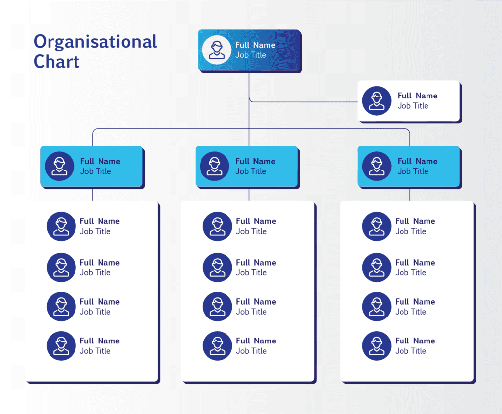
Charts
Organisational charts are commonly used in bids to show the structure and reporting lines of a team. Flowcharts can illustrate complex multi-stage processes, workflows, or decisions in a way that’s easy to understand. Gantt charts are often used to represent the proposed timeline of a project.
Photographs
Showcase your team’s smiling faces, your products, past projects, or completed work. If you don’t have your own, select suitable stock photos that represent your industry. Photos are emotive, depict realism and convey authenticity – one of three drivers in building trust in tendering.

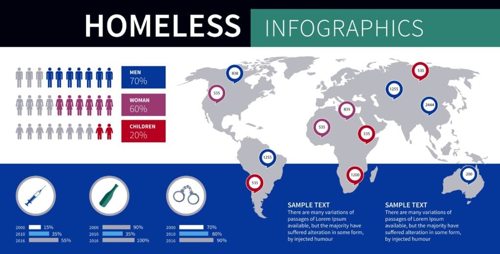
Infographics
A blend of data and design, infographics combine text, statistics and/or imagery into a clear visual overview of a complex topic. Particularly helpful in executive summaries, infographics clarify intricate concepts and/or data, providing an easy-to-digest summary of key information.
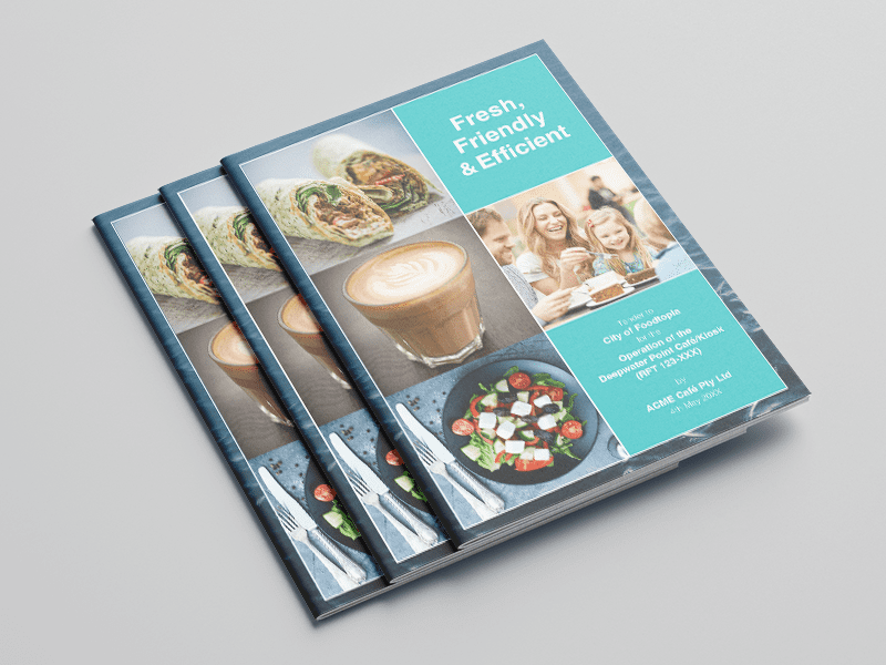
Cover pages
Well-designed cover pages create a strong first impression by providing a clear and enticing introduction to your document. Cover pages can headline your story to win and subtly convey messaging through visuals.
Icons
The use of icons can represent key ideas, replacing bullets or signposting repeated elements of a response. Icons are a common method of uplifting a proposal’s overall visual appeal.
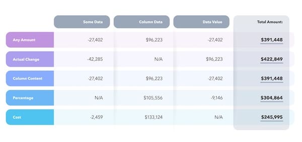
Tables
Order lists of numbers or text into a structured set of rows and columns, making it easy to interpret and compare information.
Key considerations for proposal graphics
With any type of graphic, it’s important to use clear, concise visuals with accurate data representation. But there are several other characteristics to consider when designing or selecting graphics for your proposal.
Along with clarity and accuracy, here are some key considerations:
- Source: Ideally you’ll select from an internal bid library of pre-approved graphics or create original, intentional designs. Alternatively, source high-quality, copyright-compliant visuals from reputable online stock image sources.
- Colour: As discussed earlier, colours have associated meaning and can evoke emotions. But their emotive qualities aren’t the only thing to consider. If your goal is to establish brand authority, it’s best to use your company colours. If your goal is to build trust through demonstrating empathy and understanding, you may choose to use your customer’s colours. Colour choices should be deliberate and have a purpose. A sudden change in colour may imply a change in meaning, leaving readers confused. So, choose a colour palette at the outset and avoid deviation.
- Size: Think about where the graphic is going to sit within the single page, wider response section and whole submission. Consider the amount of detail that needs to be communicated in the graphic and the paragraphs it needs to fit alongside. This can help dictate the size.
- Orientation: Typically, people read from left to right, top to bottom. More complex diagrams with multiple elements are likely to be read in a clockwise direction (unless arrows determine otherwise). To enhance comprehension, ensure your visuals guide the reader seamlessly and comfortably.
- Consistency: Consider the uniformity of your images. Are your staff photographs a mixture of landscape and portrait? Aid clarity by uniformly cropping them to a square or circle. Are some boxes in your organisational chart larger than others? Is one tier a different colour? Ensure there’s an intentional purpose for any inconsistencies (e.g. to represent hierarchy).
- Simplicity: Strive for simplicity over complexity. Although it might be tempting to add another arrow, element or explanatory asterisk, your proposal graphics should be immediately understandable and support (not distract from) your proposal’s objective.
How to integrate graphics into your document
While it’s tempting to approach proposal graphics as a simple cut and paste activity, well-considered graphic selection/creation and intentional placement must be followed by proper integration into your document.
Even the most wonderfully designed graphics will fall short if they aren’t correctly inserted into your proposal documents. Blurry or distorted graphics will distract your reader, and oversized image files may exceed size limits for document or attachment uploads.
Here are three ways you can ensure graphics are displayed at high resolution without compromising proposal document size:
1. Always insert an image from its source file.
Copying and pasting images into Microsoft Word or Google Docs can distort file sizes and lead to formatting issues. Inserting the image from its source file allows for better resolution, easier resizing, and avoids potential formatting faux pas.
2. Create graphics at the size they will appear in your proposal.
Creating oversized graphics and then shrinking them can compromise clarity and quality. Design graphics (or brief your Graphic Designer to do so) as close to their intended display dimensions as possible – e.g. ¼ page, ½ page, full A4 page, 5x5cm.
3. Choose the right graphic file format.
Proposal graphics should be embedded into page layouts or presentations in a flat, un-editable file format like JPG/JPEG or PNG, at a resolution of 150–300 PPI (pixels per inch). Professional graphic designers may use different formats (such as AI, PSD, INDD or EPS) for their working files, but should always export graphics to a JPG/JPEG or PNG format for insertion into your proposal document. JPG and PNG files can be compressed to decrease their size if needed. However, this lowers image quality so try to avoid excessive compression wherever possible.
A picture really is worth a thousand words
Although we don’t encourage you to cull 1000 words from your proposal in favour of a single graphic, the saying that “a picture is worth a thousand words” does carry weight in the bidding world.
A well-designed, intentionally placed and properly integrated graphic can catch the eye of an evaluator in a way that text alone never could. Including effective proposal graphics enhances the clarity, comprehension, memorability and persuasive power of your submission.
Together, these factors increase your likelihood of winning. And ultimately, that’s your goal!
Related reading about proposal graphics:
- Five common proposal graphic mistakes (and how to avoid them)
- Bid Academy’s Bid Accelerator program (see Module 9: Developing Meaningful Graphics)
- APMP Best Practice 101: How to Create Impactful Graphics