In a previous article, we presented our ultimate guide to proposal graphics. It explained the benefits of using well-considered graphics and how to select and integrate them into your tender response documents. But as well as exploring best practice, it’s also helpful to look at the other side of the coin – shining a light on the most common proposal graphic mistakes we encounter.
During our 16+ years of bid consulting, we’ve seen some instances of poorly chosen or implemented graphics. In these cases, the visuals have certainly worked against the proposal, rather than for it.
Here are the five most common proposal graphic mistakes we see:
1. Overly complex graphics
Tender responses often rely on evidence in the form of data and metrics. For some of this information, a graphic may be the best way to communicate it.
But an excessively complex diagram contradicts its own intent – complicating rather than simplifying the content. If an evaluator is forced to spend time interpreting the visual presentation of information, they may lose interest before comprehending the information itself.
How to avoid this graphic design mistake:
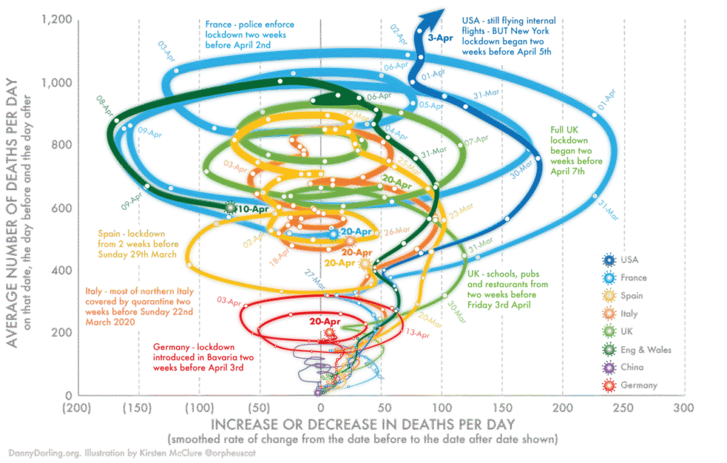
With tangled lines, dense annotations, and use of lots of colour without visual hierarchy, this diagram overwhelms the eye. A lack of focal point makes it hard for viewers to grasp the key message at a glance. Source: DannyDorling.org
Always consider that an evaluator may not have a technical background. Simple summary tables, flowcharts, and bar, line or pie graphs are almost universally understood. These will suffice to explain most datasets. Use technically complex diagrams sparingly, aiming for visuals that can be understood in ten seconds or less.
2. Diagrams highlighting gaps
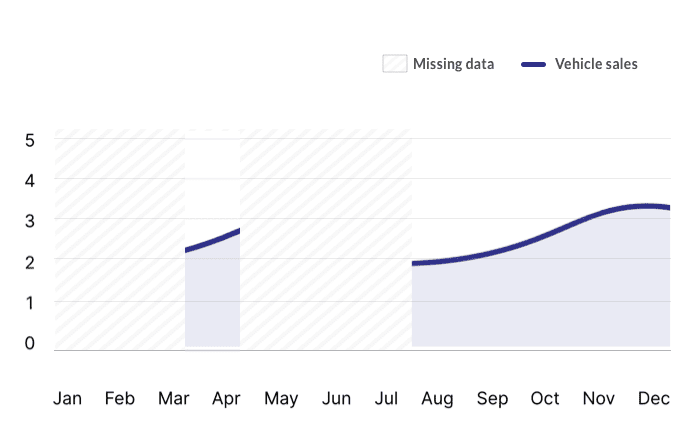
The clearly marked "Missing data" areas in this chart draw immediate attention to the absence of information and detract focus away from the data that is present. This could lead readers to question the analysis or data collection. Source: ux.stackexchange.com
Although graphs and schematics are often essential components of a proposal, they can unintentionally highlight process gaps, data shortfalls or other problems.
If a proposal graphic visually shows (or unintentionally accentuates) a process, information or conceptual gap, it’ll be noticeable to an evaluator. They may exclude your proposal from further consideration for this reason.
How to avoid this graphic design mistake:
Use the graphics creation process to interrogate the logic of your data, process or solution. If your information can’t seamlessly translate into a graphic without obvious gaps, this signals that it should be refined before being proposed.
3. Photographs lacking professionalism
Demonstrating your personnel, products, skills and experience to a prospective customer is important. Photographs are an excellent way to showcase these in your bid.
But if your photos are poor quality, badly composed or irrelevant, this will fail to show your organisation in its best light – figuratively and literally.
How to avoid this graphic design mistake:
Personnel, product and project photos should all look professional be relevant to the bid in question. Align photos of previous work with the proposed project as much as possible – showing similar services in similar industries or areas.
When taking photos, consider lighting, suitable backdrops, appropriate attire for any personnel and balanced composition. If you’re not a confident photographer, consider using a professional – especially for important images that lend themselves to being repurposed for future bids.
Here, the poorly lit, badly composed centre selfies undermine the proposal’s professionalism. Their distracting backgrounds – with extra people or messy surroundings – clash with the others, which consistently feature clean, professional backdrops and lighting. Source: iStock
4. Relying on text explanations
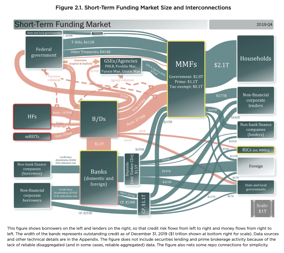
This diagram relies heavily on its lengthy caption, as the titles, shapes and labels aren’t clear enough for quick understanding. Viewers depend on text to decipher it, so further clarification elsewhere in the document is likely also needed. Source: U.S. Credit Markets report, October 2020.
Needing to accompany images with long and detailed text-based descriptions is an indicator that the images aren’t the right choice. Every graphic should be able to depict its message without relying on a wordy explanation or caption. Reviewers and evaluators should be able to understand your graphic simply by skim-reading or scanning accompanying text.
If a graphic needs extensive text to make any sense, it’s not doing its primary job which is to simplify the written content by displaying it visually. In such cases, your graphic might be unnecessary, as the text itself is likely communicating the message more effectively.
How to avoid this graphic design mistake:
When using proposal graphics, ask yourself: would I be able to understand this graphic clearly without the surrounding text? Can readers understand it in isolation, in ten seconds or less? Keep the goals of good proposal graphics in mind – to aid understanding, boost clarity and add value.
5. Disguising text as a graphic
Trying to force a large piece of text to operate as a graphic often results in a diagram overloaded with too many words. This approach makes your visual content look inconsistent, cluttered and confusing. It also hinders the editing process, as text that has been flattened into a JPG or PNG image can no longer be altered.
And if you’re loading up a diagram with unnecessarily long headings or explanatory sentences/paragraphs, the visual is likely to be repeating a lot of the proposal’s written text – rather than simplifying or summarising it.
How to avoid this graphic design mistake:
In graphic diagrams, use text sparingly and only to highlight or label key points. Apply colour, contrast, or alignment variations to make the minimal amount of text easy to scan. Trust the evaluator to interpret the graphic visually, and if required, save comprehensive explanations for the proposal text.
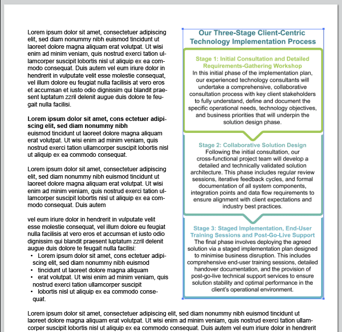
Here, large text blocks have been forced into a graphic format. Each stage is overloaded with lengthy explanations, preventing quick understanding. As a JPEG, the content is uneditable. A simpler diagram (using just headings and icons), supported by detailed explanations moved to the proposal's body text, would be more effective.
Learn from the proposal graphic mistakes we’ve corrected for others
With over 16 years’ experience working with hundreds of clients on thousands of tender submissions, our senses have been sharpened to recognise what works – and what doesn’t. Thankfully, you can learn from our experience and avoid repeating common proposal graphic pitfalls.
Graphic design contributes to the visual representation of not only your proposal, but your organisation, your professionalism, and the quality of your solution. So it’s crucial your proposal graphics work for you, not against you.
Overly complex or convoluted graphics, diagrams that unintentionally highlight gaps, and unprofessional photos won’t do your proposal any favours. Graphics that can’t stand alone without text explanation, or are overstuffed with too much written detail, aren’t doing their job of simplifying and summarising information.
Using suitable, high-quality proposal graphics is one of the best ways to aid an evaluator’s understanding. So when preparing your next bid, be sure to check for these five common proposal graphic mistakes, and fix them where needed. This will ensure your visuals add value, enhance your win themes and help put your best submission forward.
The Three Cs – Customer, Competition, and Capability – provide a powerful lens to examine your entire bidding process through. Learn how to use this strategic framework to position early, align with customer needs, differentiate from competitors, and demonstrate sustainable capability to deliver – boosting your chances of tendering success.
One of the most effective ways to aid understanding in your tender responses is to use suitable graphics. But why are they helpful, what are their benefits, and how do you select/create the right graphic and integrate it correctly into your document? All this and more is covered in our handy guide to proposal graphics.
Commercial terms are an aspect of bidding often overlooked by proposal professionals. Nigel Dennis explains a more effective approach to categorising and presenting commercial clarifications in tender submissions, to improve your chance of success.